Ahhh, magical coffee. While those of us in Paleo/CrossFit land shun every other vice we have a passionate love affair with coffee. Perhaps, it’s because it causes a dopamine release which enables a better workout? Perhaps, it’s because, as Andy Deas once commented on the Paleo Solution Podcast, “I have so little left…”.
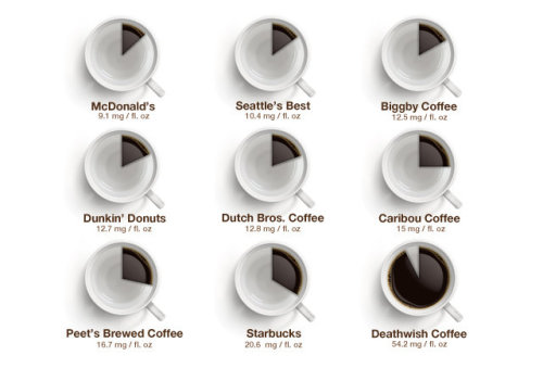
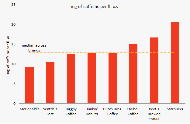
So, being the coffee-phile that I am, and the fact I love charts, I was stoked when I came across a diagram on laughingsquid that compared the caffeination levels of various coffees. Unfortunately, their display of the data was basically an abomination, so I had to go ahead and create my own version of the chart. It’s not nearly as cute but it does accurately compare the caffeine from the different coffee retailers (McDonald’s, Seattle’s Best, Biggby Coffee, Dunkin’ Donuts, Dutch Bros. Coffee, Caribou Coffee, Peet’s Brewed Coffee, and Starbucks).
Here’s the original data from Thrillist (via laughingsquid).

You can basically consider this the end of this blog post. That is, unless you want to hear my rant on why the original chart stinks.
So many reasons:
- Pie charts look pretty but are extremely difficult to analyze visually (i.e. the whole point of a chart). For example, Caribou and Peet’s look virtually identical. Compare the data though and there is nearly a 20% difference in caffeine levels.
- Pie charts are used to show percentages of a whole. Caribou Coffee appears to be about a quarter of the whole. The whole what?
- Deathwish Coffee does not sell brewed coffee and seems to have been added to the chart simply for shock value (it is definitely gnarly sounding).
Alright. Now I’m done.


xpn35h